
Objective
Reviews.com wanted to update their landing page with a more modern and professional look while also raising engagement throughout the site.
Result
We discovered that users entered the site via Google and rarely entered the home page. A user entering the home page only wanted to use the search box, therefore I created a home page design that highlighted the search box experience and included visual modules that boosted user engagement for important income-growing pages.
Challenges
The company made their income with partnered click-shares. We ran into many challenges interpreting the CTR data. There were many variables that would affect engagement including: time of day, Google's SERP policies, holidays, etc.
Quantitative data proved to obscure user intent and the team had decision paralysis when it came down to making changes in fear of losing income
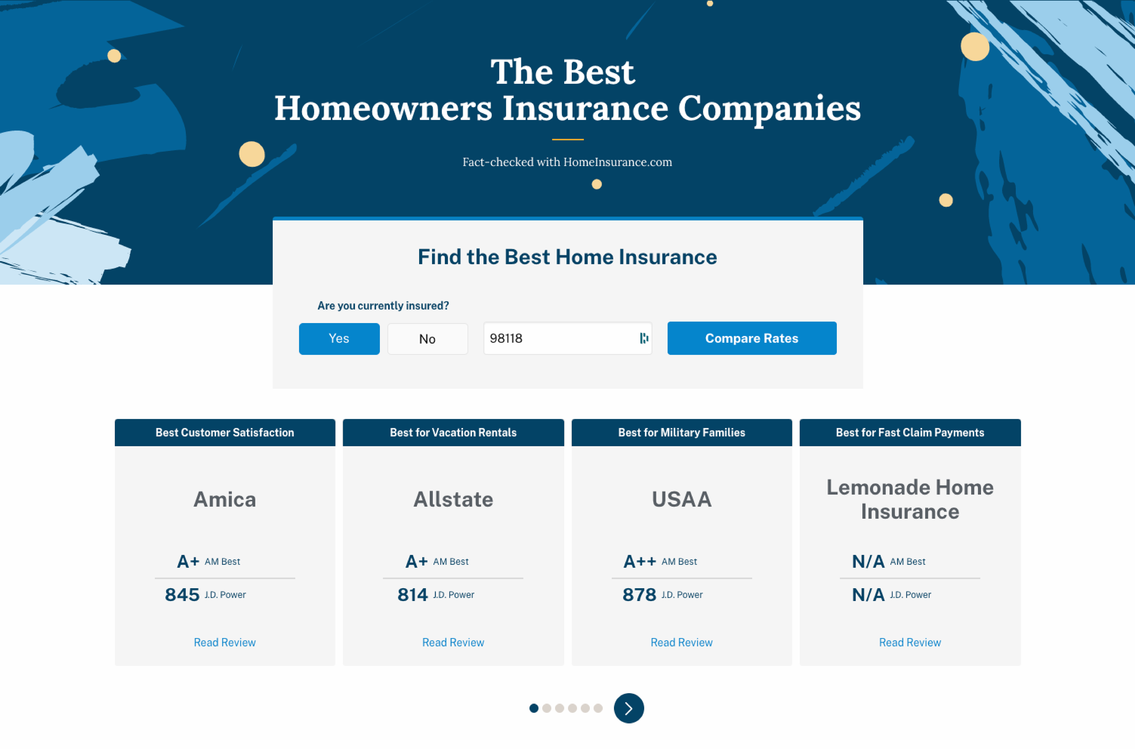
Home Page

Research Tools
The area with the most engagement was the search bar therefore we decided to create an experience where the search bar was the most prominent thing on the page.
We utilized heat maps, click rates, and AB testing in order to understand user intent and motivation. Our research tools were Optimizely and Validately.
Design and Iterate
We received success in adding search bar as masthead experience. From data analysis of v1-1.5, we understand that about 20% of click-share engages with the second module of the page.
Anything above the fold had drastically more click-shares than anything below the fold.
After letting 4 iterations play out over a course of time with telemetry collection, we decided to add targeted review pages to see what kind of clicks can be promoted.
Search Box Experience
Our goal for this project was to improve the search experience to generate predictive results. The redesign provides the user with relevant review pages, blog posts and featured products. It also suggests alternative search queries so the user is not left in a cul-de-sac if they do not type the word correctly.
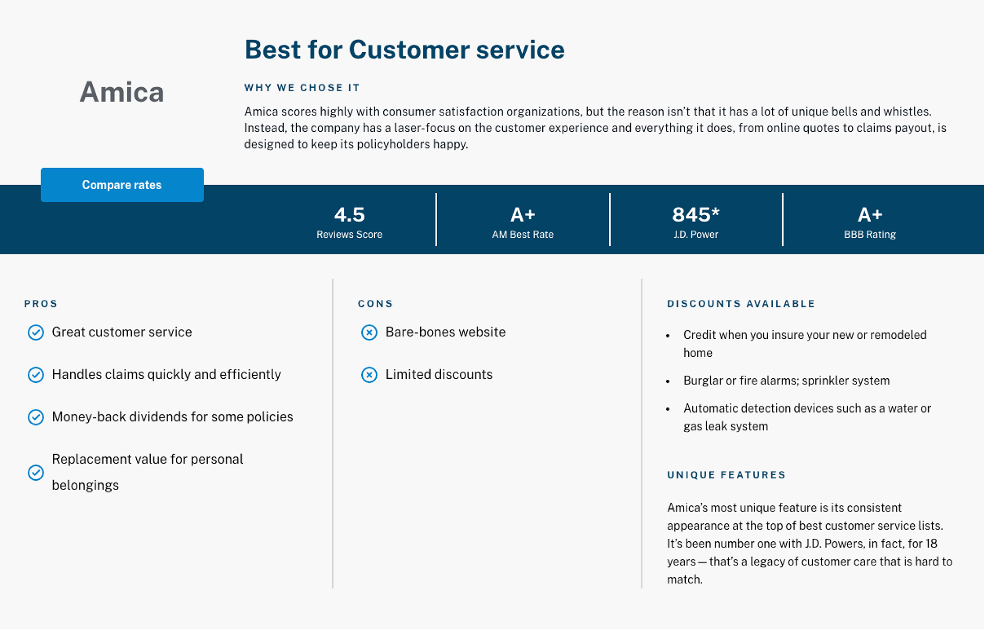
Graphs & Modules
In addition to redesigning the home page and search box experience, I also worked on creating interactive modular components in various pages such as insurance, internet and technology, beauty products, etc.
Reflections
Collaborate, collaborate, collaborate! As cheesy as it sounds, there really is no "I" in team. I would not have been able to be so successful and understand the data without my amazing team here at Reviews. I genuinely feel honored to be able to learn from such great minds.
Incorporate usability testing early on. The company mainly used CTR and quantitative data to track our user and created hypothesis' around their intent. Unfortunately, I did not fully understand the value of qualitative user feedback until much too late. Data and money drive business decisions, therefore creating a story around the user's experience that aligns with the business goals is the best way to present to stakeholders.
Constantly learn and innovate. By thinking outside of the box (literally outside of the grid), we were able to create a home page that wasn't just a bunch of articles in boxes, we took out the idea of the grid for a moment and created full-page experiences which I believe is the future of web design.


